Radio Button
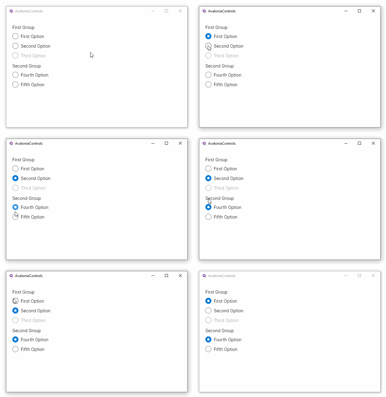
The RadioButton control presents a group of options from which only one may be selected at a time. A selected option is drawn as a filled circle, and an unselected option as an empty circle.
The content of the radio button control is presented as a label next to the circle.
It is possible for no options in a group to be selected, however as soon as one is selected, the radio button interaction cannot be stopped by the user.
Useful Properties
You will probably use these properties most often:
| Property | Description |
|---|---|
GroupName | Defines the name common to a group of options that will interact as radio buttons. |
IsChecked | Whether a radio button option is selected (true) or unselected (false). |
IsEnabled | Whether a radio button option is enabled. Disabled options are presented faded. |
Example
This example shows two groups of radio buttons working independently:
<StackPanel Margin="20">
  <TextBlock Margin="0 10 0 5">First Group</TextBlock>
    <RadioButton GroupName="First Group"
              Content="First Option"/>
    <RadioButton GroupName="First Group"
              Content="Second Option"/>
    <RadioButton IsEnabled="False"
              GroupName="First Group"
              Content="Third Option"/>

  <TextBlock Margin="0 10 0 5">Second Group</TextBlock>
    <RadioButton GroupName="Second Group"
              Content="Fourth Option"/>
    <RadioButton GroupName="Second Group"
              Content="Fifth Option"/>
</StackPanel>
More Information
info
For the complete API documentation about this control, see here.
info
View the source code on GitHub RadioButton.cs